Typography is the meticulous arrangement of letters and text, crafting copy that is not just legible but visually appealing. It goes beyond fonts, encompassing style, appearance, and structure to evoke emotions and convey messages. Typography breathes life into text, making it a dynamic force in design.
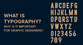
Photo Credit: Designhill
Why is Typography Important?
Good typography isn’t just about beauty; it builds a personality for your website. Users subconsciously associate the typeface with your brand, fostering trust and a strong user following. Consistency in typography carries your brand forward.
Influencing Decision-Making
Typography profoundly affects how users digest information. Eye-catching type is persuasive, reinforcing the message of the text. It guides users, optimizing readability, accessibility, and ensuring a stellar user experience.
Holding the Attention of Readers
The difference between a one-minute visit and a half-hour exploration lies in good typography. Visually stimulating websites, crafted with attention to typography, engage and captivate readers, ensuring a memorable experience.
6 Typography Rules Every Designer Should Master
Practice Correct Alignment
Understanding alignment is crucial. Left, center, right, or justified—each has its place. Left alignment is common for readability, while justified alignment requires careful handling to avoid readability issues.
Work with Grids
Grids ensure logical and visual harmony on the page. They provide cohesion, making everything look interconnected. While not necessary every time, understanding grids is crucial, especially in typography.
Pick an Excellent Secondary Font for Pairing
Font pairing enhances readability. Use different typefaces for headings and subheads to establish visual hierarchy. Ensure the second font complements the primary typeface without causing inconsistency.
Choose Your Font Palette Wisely
Color matters in typography. Use color theory to create a font palette that complements your design. Ensure font colors aren’t distracting, maintaining clarity and conveying your message effectively.
Avoid Stretching Fonts
Respect the intricacies of fonts by avoiding stretching. Stretching compromises a font’s efficiency and value. Opt for fonts that naturally fit your design needs without distortion.
Remember, White Space is NOT Empty Space
White space is a valuable tool. It directs focus, adds sophistication, and allows the design to breathe. Utilize white space smartly to enhance your composition and elevate the overall design.
Follow these rules, understand the art, and witness how Volar Media House, your trusted advertising partner in Pune, can transform your designs into captivating visual experiences. Elevate your brand with the power of effective typography!